30 Days of Mapping
Mapping the sh*t out of it
Long time lurker, first time poster. This year was my first try to contribute to this exciting challenge.
I missed some of the topics due to the lack of imagination/data/commitment or various otherworldly reasons. Below, a selection of the visuals I prepared. Some of them may be in need of additional polishing and design improvement. Will get back to them when I feel like it.
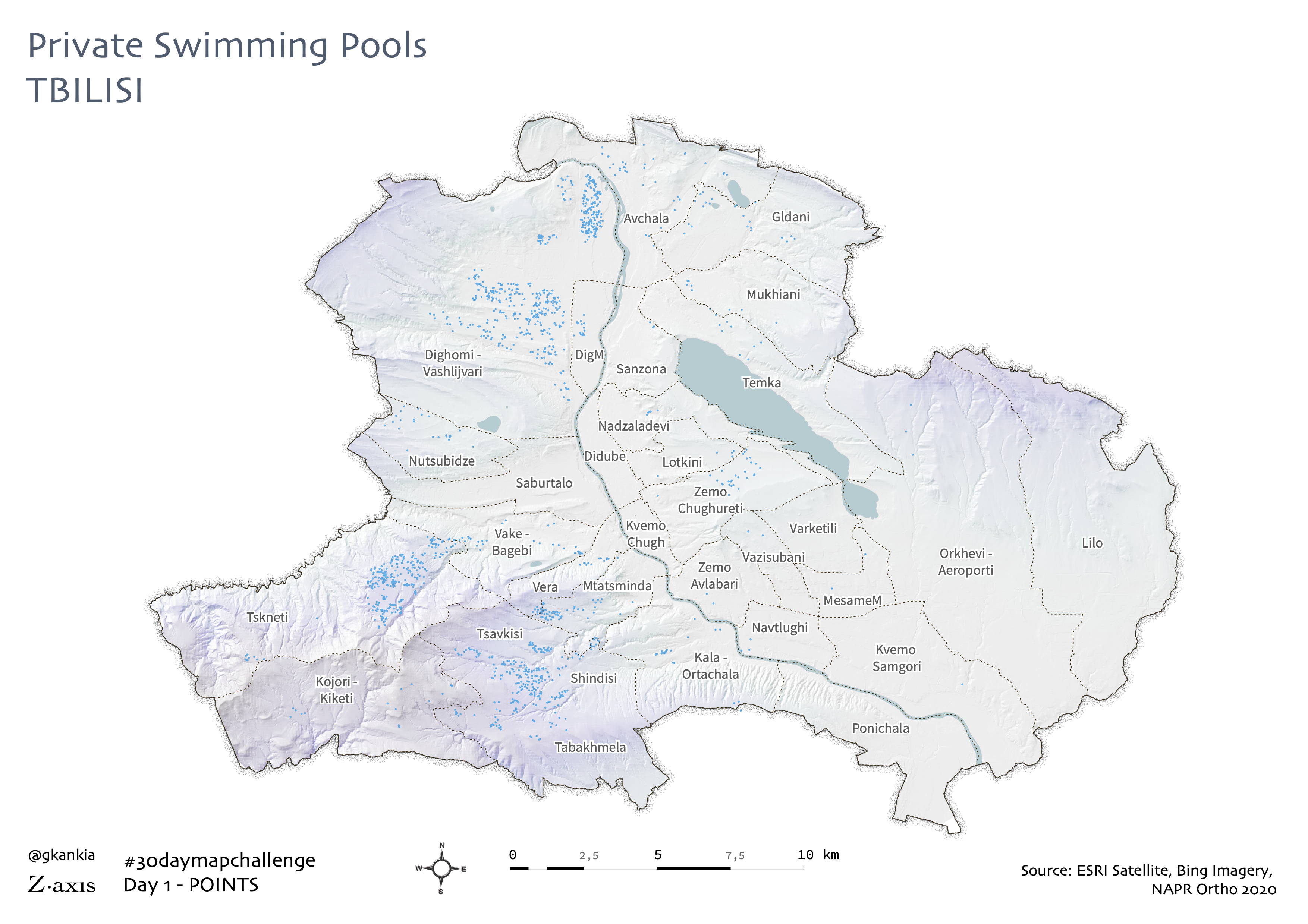
This map shows the spatial pattern of private swimming pools scattered across the administrative boundaries of Tbilisi, Georgia. The uneven distribution mirrors the socio-spatial division of the city, with most of the wealthy suburbia residents with their own swimming pools to escape the scortching summer temperatures of the city.
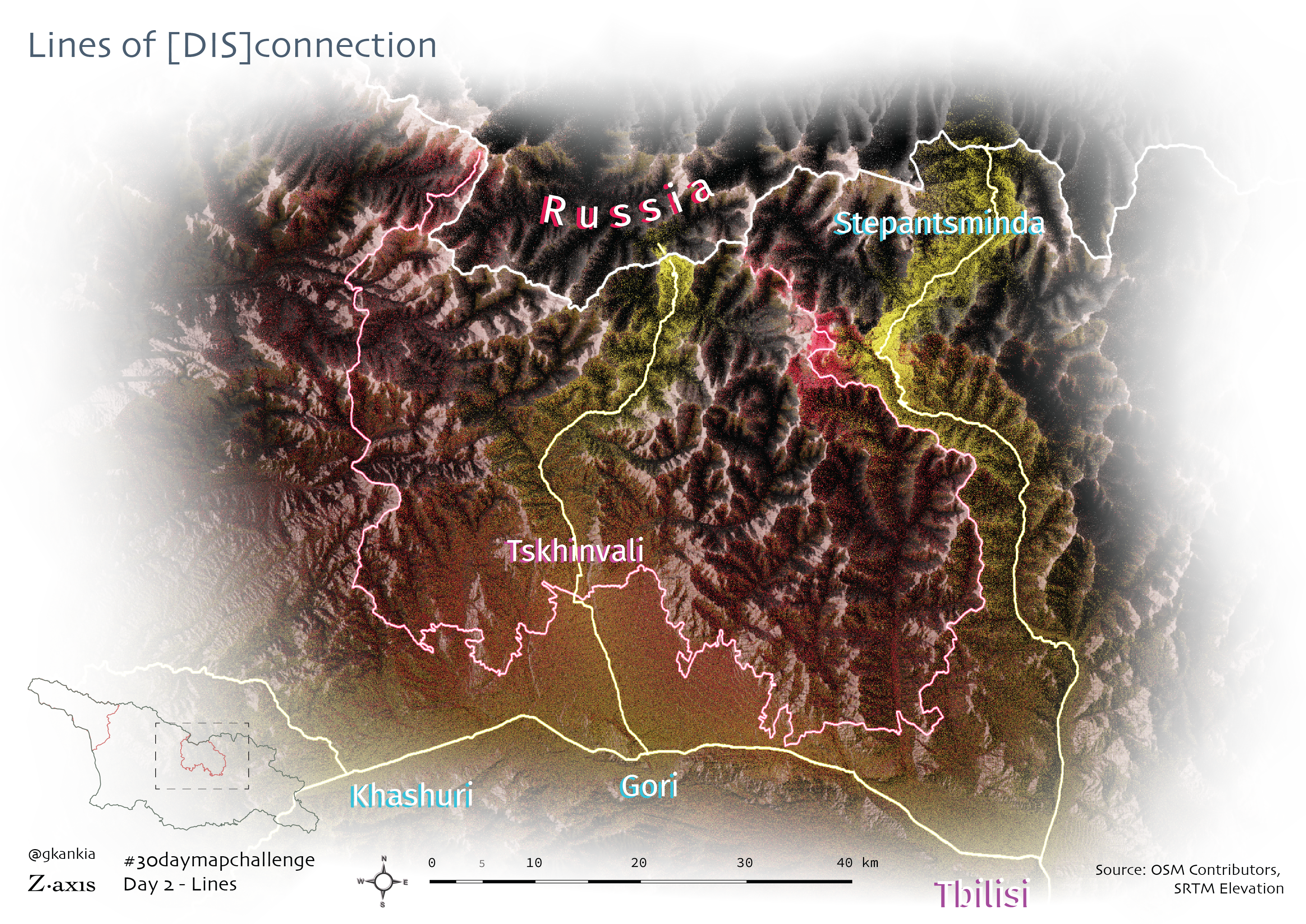
Two types of lines are depicted here. The red and yellow lines serve as a reminder that simple lines, such as borders or roads on the map can bear two completely opposite functions. They can be both, divisive and connective.
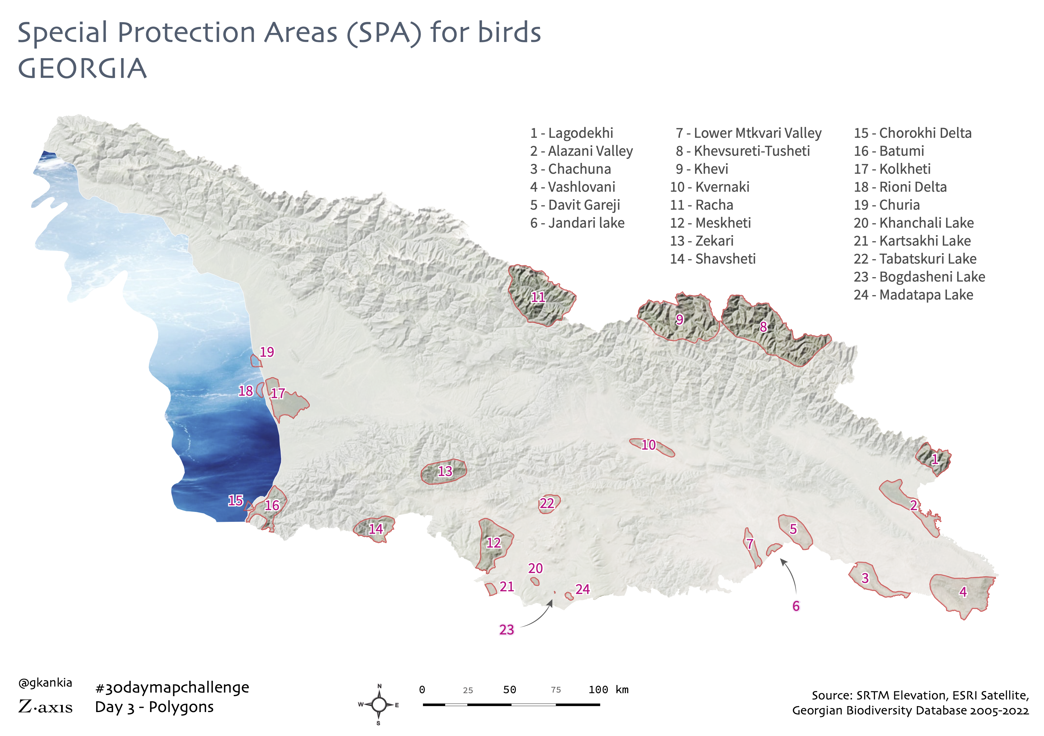
Even though the map shows some of the key spots for birdwatching in Georgia, it does not necessarily show all of them. There may be other areas of interest for birdwatching, though without formal protection. Abkhazia and Tskhinvali region are excluded here as they remain out of reach for researchers from Georgia to cover the areas that surely are there.
The panorama captures the Enguri river gorge in Svaneti region, North-West of Georgia, bordering Russia with its glaciers and peaks in the background. Svaneti is one of the most popular tourist destination in Georgia all year-round.
Georgian volunteers have been fighting in Ukraine since the initial proxy invasion by Russia. Since Russia's full-scale invasion of Ukraine on February 24, 2022 a total of 24 Georgian fighters have fallen in combat operations as of making this visual, November 5, 2022.
This Tbilisi tram network map of 1962 routes is a few years old, however, it is well worth sharing it again on the occasion of the #30daymapchallenge. This visual serves as a reminder that despite how faulty the whole Soviet system might have been, their approach to urban transit planning did make a lot of sense.
The interactive visual below tracks the nitrate pollution in the Black Sea from March, 2019 up until April, 2022. Higher levels of nitrate pollution poses a threat to marine life and the biodiversity. Data was collected from Copernicus Database.
Looking at two central districts in downtown Tbilisi, it is striking to see how these adjacent, historic neighbourhoods have two completely different urban layout. The reason lies in the spatio-temporal difference. Kala emerged as the first urban settlement along the Mtkvari river and Tabori range, hence its medieval-style layout. Chughureti neighbourhood on the other hand, was planned and developed in the XIX century under Russian Empire, with contribution from architects and planners from Europe, on a relatively flat left bank of the river.
Georgian polyphonic folk song "Chakrulo" was sent to space on board of Voyager missions back in August and September 1977. The mission is NASA's longest in operation so far, as both Voyager's have been floating in space for over 40 years and have already gone beyond the solar system.
I don't make bad maps, so I am skipping this one :)
This map highlights the arrests of local residents along the Tskhinvali region administrative boundary line. Detentions are carried out by Russian occupation forces and South Ossetia's KGB guards. People are kidnapped from their own plot of land, or simply from open fields while herding their own livestock. The data plotted here is from 2014 to November 2022. A total of 144 incidents are mapped here, while the actual number of detentions is throught to be much higher.
Not a typical map for the topic of scale, but it is still very much relevant. Below is a visual summary of my latest MSc thesis on Stockholm's new golden bridge, Guldbron project. This seemingly routine urban infrastructure and regeneration project jumps from one scale to another incessantly, changing its fluid forms and modifying socio-technical and spatial relations at the same time.
I used Blender to render this visual. It took a total of 15 minutes, so technically, does not count as a 5-minute map, but anyways. Please, enjoy the shaded relief of the Mount Ararat with Bing Imagery black and white overlaid on the SRTM 30m digital elevation model.
This hexagon map visualizes the wildfire prevalence in Georgia for over two decades, from 2001 to 2022 aggregated to 5-km hexagon grid. It's worth noting that due to methodological limitations of the satellites used to track wildfires, detecting a smoke emitted in the air does not necessarily mean that it's a forest fire. The three outlier lines shown on the map are the result of factory emissions in major industrial areas in Rustavi, Kaspi and Zestaponi.
The map of Khinkali and Khachapuri hostpots in Tbilisi comes from Z.axis urban food geography project. The data used here was collected from Google and I analysed what keywords the name of the restaurants included to highlight their specialty. Turns out, some of the poshiest neighbourhoods in Tbilisi are immune to traditional Georgian food, at least in the way they are trying to position themselves on the market.
Using Robin Hawkes' hachure map style tutorial, I designed a rather abstract visual of a portion of Egrisi mountain range in North-Western Georgia. The styling gives it an artsy touch, but it represents a real terrain as it is based on a SRTM 30-m elevation data.
As an urban geographer and planner, I have a special curiousity in exploring cities through human sensory elements, such as body, touch, smell or sound. This particular visual is an excerpt of a mapping note I took while walking down one of the central neighbourhoods in Tbilisi and identifying smells along the route. Having overcome COVID-19 for a couple of times, have significantly affected my sense of smell. Regardless, I gave it a try to map out a personal experience of an urban smellscape. This one definitely needs more work to improve visually.
A concept rendering of a futuristic city, based on real urban footprint data with exaggerated building heights based on the number of storeys.
I used a simple tool of playing with projections to represent this Georgia-centered globe of the world in Mollweide Projection. The interactive, web-based tool can be accessed here.
For the day 20 of this challenge, I created this simple map of island of Sandön in Stockholm archipelago. The settlement of Sandhamn is a top summer destinatiton for weekend getaways or longer periods to enjoy Swedish summer. I very much enjoyed every visit on this island. With the harmounious mixture of nature and human habitat, 0 cars and tranquility, it is indeed a great place to squeeze even a day-trip from Stockholm.
It turned out to be a fun mapping exercise to work with Kontur population dataset. Aggregating data from multiple sources, such as Facebook, Microsoft, satellite imagery and so on to a 400m hexbins, it indeed offers a very granular look at demographics on a global scale. For governments, this could give a valuable insight into the demographics of the area they can not control, such as the case of Georgia. Official population census does not cover the occupied regions of Abkhazia and Tskhinvali, and therefore, no reliable estimates about the people living in those areas exist, apart from similar estimations. One might have never predicted that the Tskhinvali city was double in size than Gori. But obviously, there are limitations and inaccuracies in the data. Some of the calculations may seem to be exaggerated, but again, it offers a valuable look into the regions one might have not had the chance to look at otherwise.
...And as a bonus, here's a West Georgia population density visual. Sokhumi seems to have been invaded by Russians?
This map, based on 2014 population census in Georgia, shows areas in the country, where there is noone living within a 1km-grid.
For this topic, I took a draft analysis I had shelved a couple of years back, and regretted doing so at some point. Thanks to the great world of Twitter, some of my followers immediately hinted at possible glitches and inaccuracies in data and analysis and quite rightly so. Since the data was taken from OSM and had not been updated since 2019, it indeed missed some of the important locations. However, it still sheds some light on a general trend in regional geography of religion in Georgia. Will work on future updates to this dataset.
I created this map following the great tutorial by Andriy Yaremenko. The lego style is fun to look at while also highlighting information very clearly. The dark red spot is a 500m-grid where the GITA Technopark is located. Being a Georgian version of Silicon Valley, the Technopark indeed needs a faster internet connection that the regular network users. Hence the difference.
Technically, there are more than two colours on this map, but with its minimal design, subtle shading and topography, it shows the region of South Caucausus with two major colour gradients.
This visual shows what the Caucausus might have looked like millions of years ago, with high water levels and mountains. It may also look something similarly if the water levels rise to 1000 meters. Quite an apocalyptic look at the region, but it might help settle the territorial disputes or may even exacerbate existing conflicts due to resource scarcity and harsher envirtonmental conditions?
Since I was lazy enough not to make a map on this great topic, my last resort was an online tool called Music Scapes. It uses your Spotify playlists and listening history to create a landscape based on the algorithm. It's definitely worth a try.
I created this 3D view visual of Puerto Rico trench using John Nelson's excellent step-by-step guide on dioramas in ArcGIS Pro.
From the very beginning, when I started trying Mapbox Studio, I felt quite insecure of what the actual f*ck I was doing. However, soon enough, I realized that this is a tool that requires almost zero JS knowledge to create some very beautiful spatial visualisations. This is the result of one of my very first tries of interacting with this amazing tool. There's a detailed tutorial on how to make terraced views like this.
This can also be counted as cheating, but here's a remix of that apocalyptic Caucasus map with a slightly different design and colour palette. Anyways, it's a remix, so pretty much anything counts.